Wednesday, January 8, 2014

For this project I sculpted fire in a book.  It was hard to cut all the pages out and it took a long time to make it look the way I wanted it to.  I chose to do fire because it seemed like the best idea and I thought it would turn out cool.  It was very important on this project to have a plan because if you didn't, you would cut out the wrong area and screw up your whole book. I had to plan out my 6 layers beforehand using numbers so I wouldn't forget.  In my project, all the layers are a different color.  It was challenging to cut the crooked lines to make the fire.  Straight lines would have been a lot easier, but then the final product would look boring and not realistic.  I just took my time and it turned out good in the end.  Lastly, I added a border to give it more color and keep the outside from looking so dull.  I think it turned out pretty good in the end, even though it wasn't the most complex design. 

Thursday, December 19, 2013

Multi-Media

For this project I drew candy inside of glasses.  I chose candy to show amusement because everyone loves candy.  I chose the glasses because I thought of amusement as seeing something you enjoy.  I used variety in the colors, the candy shapes, and candy sizes.  I tried to used similar colors throughout, but at the same time not put the same colors next to each other.  I used blue watercolor paint to color the background, and I used colored pencils to color the glasses and candy.  I used tape on top to make it look more like a lense. From the visual journaling practices I learned about how different materials, like tape, change the look of a piece.  The only challenges I had were trying to find enough candies and sweets to fill up all the squares.


Monday, November 18, 2013

Self Portrait


For this project Miguel and I worked together to create our face. It was supposed to be our faces cut in half and put together, but the bottle caps were too big to add that much detail. We used different colored bottle caps for each side of the face to create a contrast. We had to spray paint the bottle caps before we glued them on because the caps on their own we're not different enough to create a face. We chose bottle caps because I had a lot of them at my house and I thought they would look cool. The caps turned out to be difficult to work with because they were almost too big to make it look like a face. Lastly, we added newspaper and magazine cutouts to the background so it wasn't just a blank piece of cardboard. 

Thursday, November 14, 2013

Sticky Situation


For this project I painted a flat tire with tools to fix the flat tire. I used acrylic paint to make the picture. I had some other ideas like a broken bridge and a tornado. I chose a flat tire because it looked like the best idea and I thought it would look the best. The theme was repetition, and I accomplished this with the bike spokes and the multiple tools. I had trouble creating value with the paint and the shadows. And I tried to used many colors so the tools weren't all grey along with the road. The mini lessons helped in choosing which paint I wanted to use and gave me a little practice with using paint again. 

Friday, October 4, 2013

Up Close and Personal
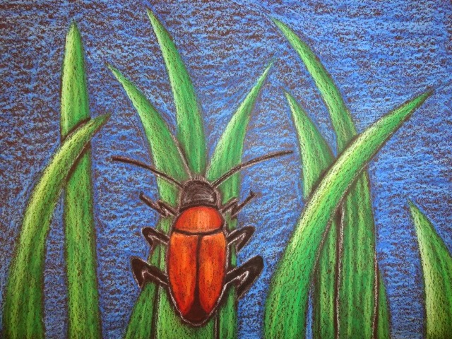
For this project I drew a beetle on some tall grass. The idea was to make it up close and personal, so the bug is large and detailed. I used oil pastels as my medium and drew on black paper. I chose black paper because it brings out the contrast of the green grass and the orange bug. I chose oil pastels because I liked the bright colors and blending them together. Before the final project I thought about drawing binoculars and a person looking through them. I didn't choose this idea because is thought the bug would look cooler. But I liked the way my project turned out, especially with the emphasis on the orange beetle.


Wednesday, October 2, 2013

For this project I drew a beetle in the tall grass.  The idea was to make it up close and personal, so the bug is big and

Friday, September 20, 2013

Target Practice

For this project I drew arrows that were shot into a target from a bow.  I had other ideas to draw a mountain or a gun but I chose the bow and arrow.  I chose the arrows because I thought the idea of them in the target was cool.  For this drawing I tried to focus on contrast by shading in the lights and darks.  I shaded in the arrow tips and the feathers on the top to create more detail.  I used pencil to draw this and to shade it in.  I tried pen, but I couldn't get it to look the way I wanted it to. And when I shaded, I tried to shade in the direction of the shapes so it doesn't look completely flat.

Tuesday, January 8, 2013


For this project I created a dolphin with its head on a rock. This project took a while to mold the clay, which I wasn't very good at. And then after they were dried, we painted them. Then I added gold and silver to add shine. I think the final product was good for me, but looked pretty bad compared to the other students.

Tuesday, December 11, 2012

For this project I drew a Battleship playing board.  I think it turned out good, but its not very neat.  I think the paint job is sloppy.  I think some things were good though like the 3D effect on the bottom of the piece.  If I did this project over again, I would probably take more time while painting to make it look more appealing.  I learned from this project that watercolors are hard to paint if you dont take your time and be careful.

Monday, November 19, 2012

For this project I drew me a big ole roosta. After I got the picture, I went into photoshop and streched the image vertically. Then I widened the top to add the right effects.  So when you looked at it from the angle of the picture, it will look better than if you are looking straight down at it. This is called anamorphosis.  
For this project I used a car for my stencil. In the computer lab, I got a picture of the internet, and then used photoshop to make the picture black and white. The background is a collage of newspaper and book pages I ripped apart. This helped give the stencil texture and added appeal. For the stencil, I cut out the positive space, which is the white part. Then, with the help of Mr. Sands, we added a shadow to make it look more realistic. While cutting the stencil we used Xacto knives. You had to keep your hands away so you didnt cut your fingers. It was a struggle to make sure the parts were thick enough to stay together. After the spray paint was added, I think it turned out looking pretty good.

Monday, October 22, 2012

For this project I found a picture of a monkey, then drew it, before I printed it. I used a cutting tool to cut out a rubber square to make it look like the picture. I cut out spaces for the hair and the leaves. All the stuff that is white are the spaces I cut out. I think it looks very good.

Thursday, October 4, 2012

For this project I drew an orangatan for the printmaking. It was very important to add texture because it makes the print look more realistic. It also adds contrast. We had to have several different pictures of the animal before we could start drawing. This helped because it let you see how the animal looked from different angles. The one i chose is the best one i drew because it was a good size and had good detail in the hair and wrinkles on the face.
For this project we have Miguel jellyfishing with Patrick! We worked in teams to make these projects. I worked on the big jellyfish and coloring it in. It is very important to work as a team because it would take a very long time if just one person does the work. I think our mural looked pretty good after it was complete. This project was fun and escpecially because anyone could be a part of the artwork.

Friday, September 21, 2012

VALUE PORTRAITS

This drawing took me a couple of days to finish. I had a picture of this kid and then i had to shade in his face using the value scale. I found the different values by looking at the picture and making shapes where it is darker. I used the entire value scale because the drawing has many differrent shades. I think my drawing is okay. I think the hair looks good but the lips are too large. I think the values shade well together though. I had a few obstacles on my way to completing this project. One obstacle was getting the darks dark enough. I also couldnt figure out how to make the lips look normal. The struggle is real out there man.  

Thursday, September 6, 2012

Maus Art


We made moss art in Mr. Sands class. He mixed up the moss with other ingredients to make some pretty scrumptious looking paint. We then painted it onto the brick wall at school in different shapes. Now we just have to see if it wil grow........

Skeletal Jerry

 
Cartoon Bone Project-Jerry.
In Mr. Sands' Atr Class we drew skeletons for cartoon characters. Jerry's bones are similar to those of a human, but changed to fit inside his tiny body. I think this turned out pretty good.