
Wednesday, January 8, 2014
Thursday, December 19, 2013
Multi-Media


Monday, November 18, 2013
Self Portrait

For this project Miguel and I worked together to create our face. It was supposed to be our faces cut in half and put together, but the bottle caps were too big to add that much detail. We used different colored bottle caps for each side of the face to create a contrast. We had to spray paint the bottle caps before we glued them on because the caps on their own we're not different enough to create a face. We chose bottle caps because I had a lot of them at my house and I thought they would look cool. The caps turned out to be difficult to work with because they were almost too big to make it look like a face. Lastly, we added newspaper and magazine cutouts to the background so it wasn't just a blank piece of cardboard.
Thursday, November 14, 2013
Sticky Situation

For this project I painted a flat tire with tools to fix the flat tire. I used acrylic paint to make the picture. I had some other ideas like a broken bridge and a tornado. I chose a flat tire because it looked like the best idea and I thought it would look the best. The theme was repetition, and I accomplished this with the bike spokes and the multiple tools. I had trouble creating value with the paint and the shadows. And I tried to used many colors so the tools weren't all grey along with the road. The mini lessons helped in choosing which paint I wanted to use and gave me a little practice with using paint again.
Friday, October 4, 2013
Up Close and Personal
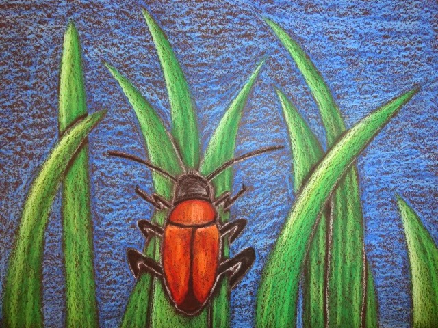 For this project I drew a beetle on some tall grass. The idea was to make it up close and personal, so the bug is large and detailed. I used oil pastels as my medium and drew on black paper. I chose black paper because it brings out the contrast of the green grass and the orange bug. I chose oil pastels because I liked the bright colors and blending them together. Before the final project I thought about drawing binoculars and a person looking through them. I didn't choose this idea because is thought the bug would look cooler. But I liked the way my project turned out, especially with the emphasis on the orange beetle.
Subscribe to:
Posts (Atom)